This dashboard allows you to use X-axis, Y-axis, bubble size, and filters to quickly reconfigure the chart to highlight opportunities.
For gym classes, opportunity usually means one (or more) of these:
High demand but constrained supply → add classes
Good attendance but low frequency → expand schedule
Low attendance but high capacity → fix, move, or remove
Instructor or format outperforming peers → replicate
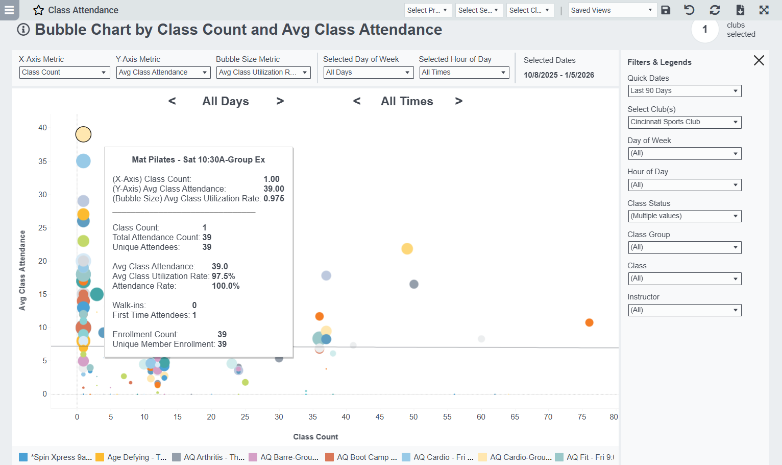
Combo #1: “Add More Classes Here”
Best for identifying growth opportunities
X-Axis: Class Count
Y-Axis: Avg Class Attendance
Bubble Size: Avg Utilization Rate
What it shows:
Upper-left quadrant = few classes, high attendance → prime expansion
These are your “sell-out” classes with unmet demand
Combo #2: “Fix or Kill” Classes
Best for identifying inefficiencies
X-Axis: Class Count
Y-Axis: Avg Utilization Rate
Bubble Size: Total Available Capacity (or Class Count if limited)
What it shows:
Bottom-right quadrant = many classes, low fill → overscheduled
Candidates for Time changes, Instructor swap, Format refresh, Removal
Combo #3: Revenue Opportunity
If you can approximate value
X-Axis: Total Attendance
Y-Axis: Avg Class Attendance
Bubble Size: Class Count
What it shows:
Classes that scale well and perform consistently
Helps justify premium pricing, larger rooms, or featured slots